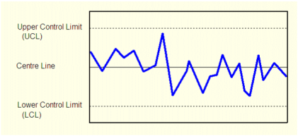
XRS charts are the primary tool of SPC and convey information about variation and control-ability. The charts are trend graphs that individually show mean (X bar), range (R), and standard deviation (s or sigma). Each point on the graph represents sub-grouped data, not individual samples.

Refer to the following for more information:
Each graph has center, upper control limit (UCL), and lower control limit (LCL) lines drawn. The control limits are estimates of where the "3-sigma" limits would lie for an approximately normal distribution. In practice the limits are calculated from the measured X double bar, R bar, and s bar, and table values which are based on the size of the subgroup used.
These lines are used as a guide for analysis as they are based on the natural variability of the process. These limits are not specification limits.
Control charts can provide valuable information about process variation. By watching for particular patterns and events, conclusions can be drawn as to how the process is controlling.
A (normal) process that is statistically under control will tend to distribute data according to a normal distribution. The data will appear randomly, but centered around the center line. Data that appears near the control limits may be infrequent but expected. Presence of data that appears outside of the control limits indicates the process is statistically uncontrolled and action should be taken to address the cause. Similarly, runs of constant data or patterns indicate instability.
The following list of patterns and events are considered to be cause for alarm:
The presence of these types of patterns and events has different meanings, depending on which type of chart is being analyzed. By using each of the three control charts together (X bar, R and s) together, a better understanding of readings is gained.
See Also
Published June 2018